Our History
Gourmet Magazine, once a leader in the culinary publishing world (1941-2009), was more than just a food magazine—it was a cultural lens into global gastronomy, travel, and storytelling. The brand shaped how people experienced food beyond recipes, connecting readers with the heritage, traditions, and personal narratives behind every dish. This rebrand aims to revive Gourmet as an immersive platform that explores the evolving role of food in society, fostering cultural appreciation, human connection, and storytelling through a global and experiential perspective.Through multimedia storytelling, travel experiences, and cultural deep dives, Gourmet will serve as a hub for food lovers, historians, and storytellers who seek more than just recipes—they seek the stories behind them.


Timeline
Our New Logo
The Gourmet logo is built from three elements: a circle, a directional triangle, and a curved base. Together, they reflect global food culture, forward movement, and human connection.

2. Directional Triangle Symbolizes exploration and forward movement, reflecting Gourmet’s mission to discover stories through flavors and cultural journeys.
1. Central Circle Represents the core of food culture — the plate, community, and shared meals. It anchors the logo with a universal, inclusive shape.
3. Curved Base Suggests warmth, connection, and support. Inspired by a smile or a shared table, it emphasizes human bonds formed through food.
Logo Development
I explored how to further refine the “G” symbol by combining cultural and food-related visuals with simple geometric shapes. Many of these sketches incorporate ideas of sharing, such as plates, bowls, and global elements that suggest unity across cultures.

In this round, I explored how to further refine the“G” symbol by combining cultural and food-related visuals with simple geometric shapes. Many of these sketches incorporate ideas of sharing, such as plates, bowls, and global elements that suggest unity across cultures.
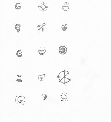
I also experimented with different letterforms of “GOURMET” to test how expressive typography could support the brand voice. These variations helped visualize how the logo might function in real-world contexts while keeping the brand message of togetherness through food.
Our Vision
To grow our impact, we’ve developed 18 brand extensions that align with our mission. Each idea explores ways to connect people through food, culture, and storytelling—across products, services, experiences, or education. Together, these extensions shape a meaningful brand future rooted in curiosity, connection, and culinary tradition.
